Quick and easy ways to create a landing page in Squarespace
From your audience's perspective, a landing page is a webpage that provides them something of value (a lead magnet, for example, an ebook, checklist, etc.) in exchange for their contact data (at minimum, their email address).
What is a Squarespace landing page?
A Squarespace landing page is a web page designed to capture leads for a business. It's usually a standalone page that's different from the main website, and it has a clear call-to-action (CTA) to get people to sign up or download something.
Landing pages are a great way to increase the number of people who sign up for your mailing list. They are simple pages that ask people to sign up for your list in exchange for a free offer, such as a report or an e-book. A well-designed landing page can dramatically increase the number of people who sign up for your list. Landing pages typically have a call to action (a button that visitors can click on) that gives them something of value in exchange for their information.
Ready to create your custom landing page?
Creating a custom landing page for your business can be an extremely beneficial marketing tool. Not only will it help to improve your website's overall appearance, but it can also help to increase conversion rates and boost sales. To create a custom landing page that will be effective for your business, there are a few important things to consider.
First, you need to decide what the primary purpose of your landing page will be. Is it meant to generate leads, sell products or services, or simply provide information about your company? Once you've determined its purpose, you can then begin designing the page around that goal.
Your design should be clean and simple, with easy-to-read text and clear call-to-action buttons. Be sure to test different versions of your page to see which one produces the best results.
Here's how you can hack a Squarespace custom landing page:
Are you looking to create a landing page for your next campaign? If so, you're in luck! There are a number of quick and easy ways to create one in Squarespace. In this article, we'll show you how to set up a basic landing page in a few minutes. Once it's ready, you can add your campaign logo, copywriting, and images with ease. So whether you're starting from scratch or just want to make your landing pages look better, Squarespace has got you covered.
Create a new landing page on squarespace
Create a new page.
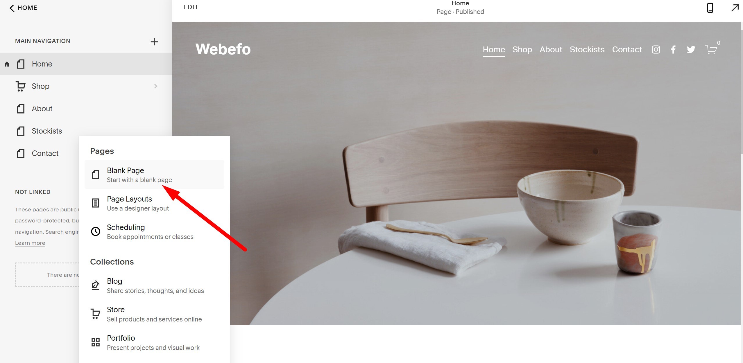
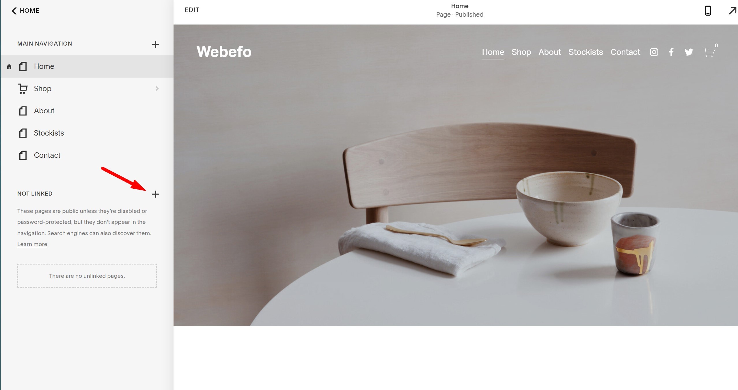
Log in to your Squarespace account and click Pages. Click the plus sign (+) next to Not Linked to reveal the option for creating a new web page that won't appear in your navigation. (You can always drag it into your navigation later if you want it to appear there instead.) Select Page.
Give your new page a title, such as your offer or lead magnet. Select the blank template under Template, and then click Start Editing.
Start Editing your landing page with content blocks
It's time to "Edit" your new landing page and Add content blocks and media files to your landing page so you'll be ready to start setting up the entire page.
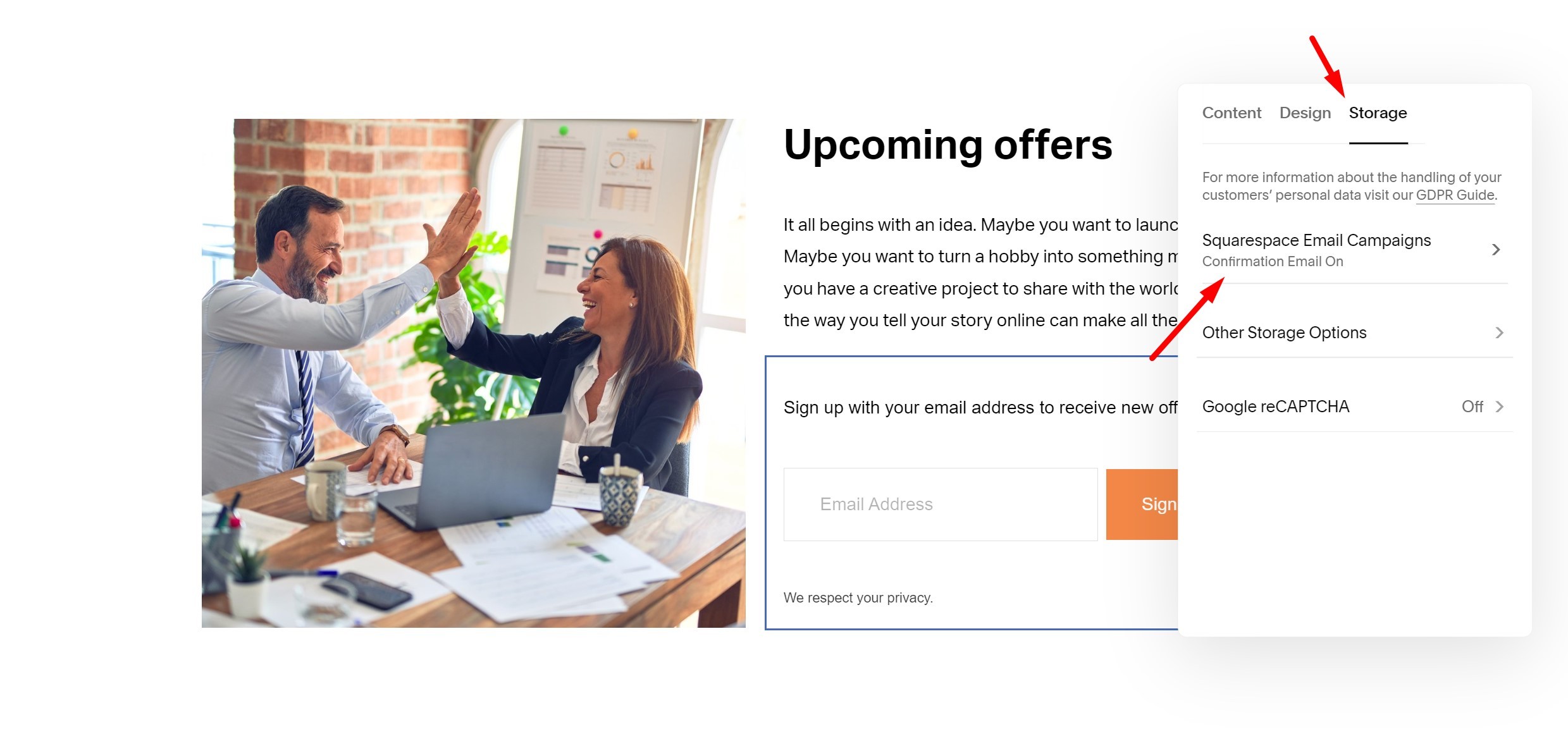
To add a Signup or Newsletter by using the Squarespace newsletter form block. After that, you need to connect your Storage (squarespace Email Campaigns) option with your newsletter form.
So, when your customer enters their email for signup you will get your customer email in your squarespace mailing list.
Remove your landing page heard and Footer
The best and best practice for reducing distraction when writing a landing page is to remove anything that doesn't serve the objective of the page. That includes removing the navigation menu, footer areas, and announcement bars (if enabled on your site).
To do that, you need a bit of code:
<!-- Hide heard and footer code -->
<style type="text/css">

#header, #footer-sections {

display: none !important;

}

</style>
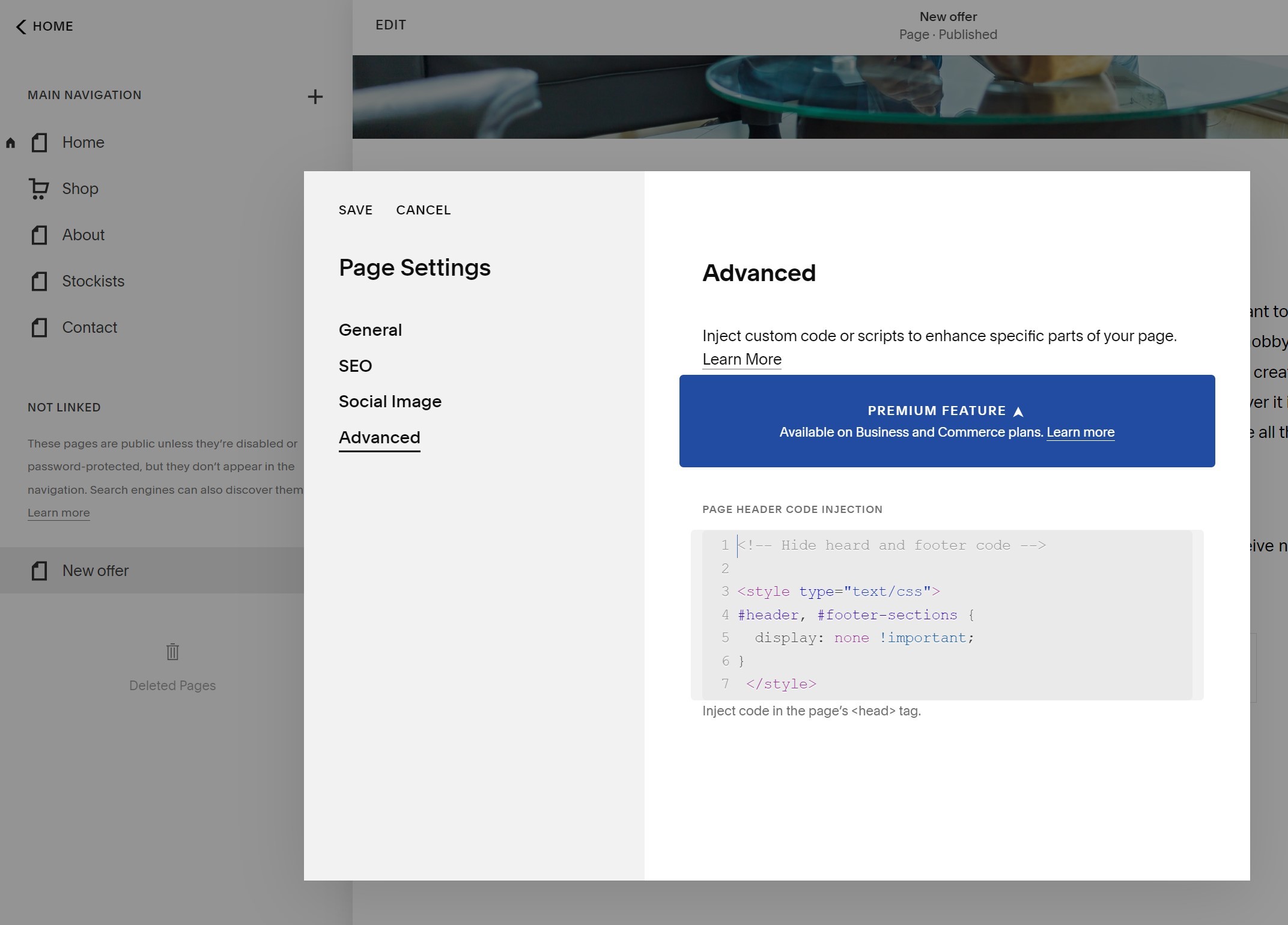
Copy the code from above, then navigate to the Settings tab for your landing page by clicking the gear icon next to your page in the left-hand menu, or saving your page and selecting Settings from the Page Content menu. With the Settings tab opens, click Advanced and paste the code into the Page Header Code Injection field. Click Save.
Disclaimer: This code may not work with all Squarespace templates. I am using Squarespace 7.1 template. Any templates in the 7.1 should work. If you are using Squarespace 7.0 template. If it isn't t working on your website s template, try searching in the SS forum ID to remove the header and footer part from your template name.
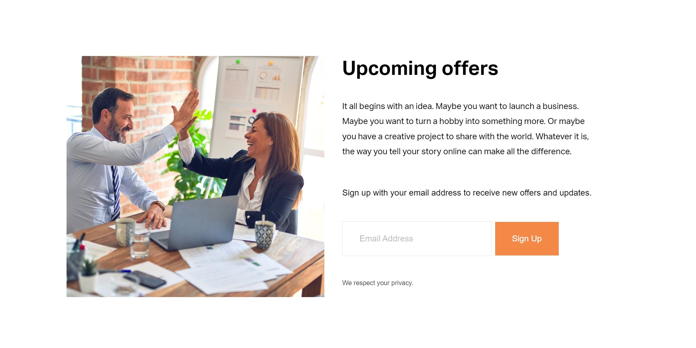
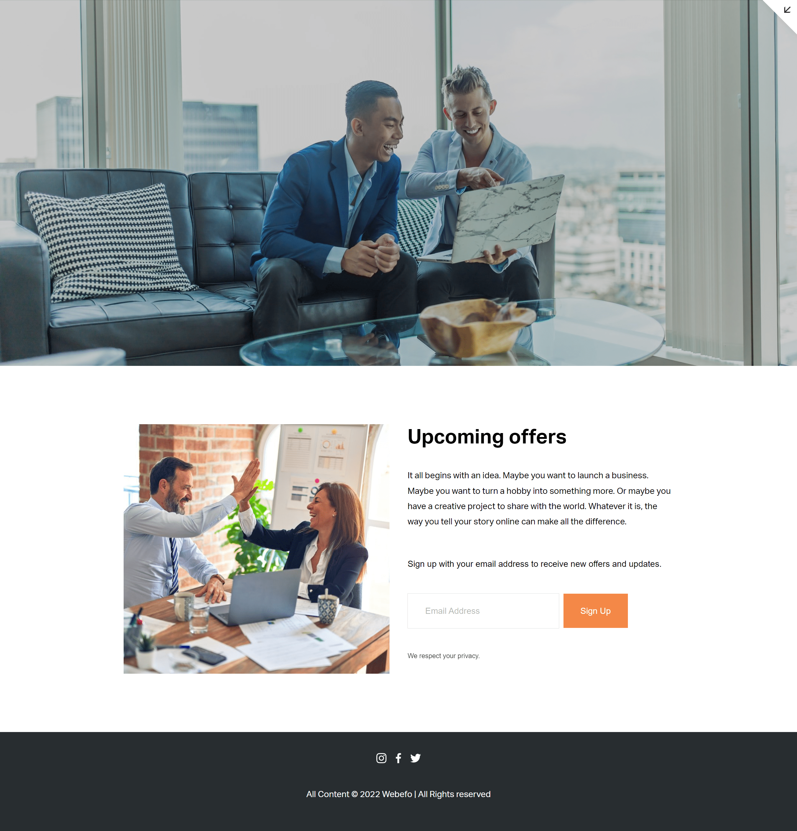
Your page should automatically refresh with your navigation menu, header, footer, and announcement bars hidden.
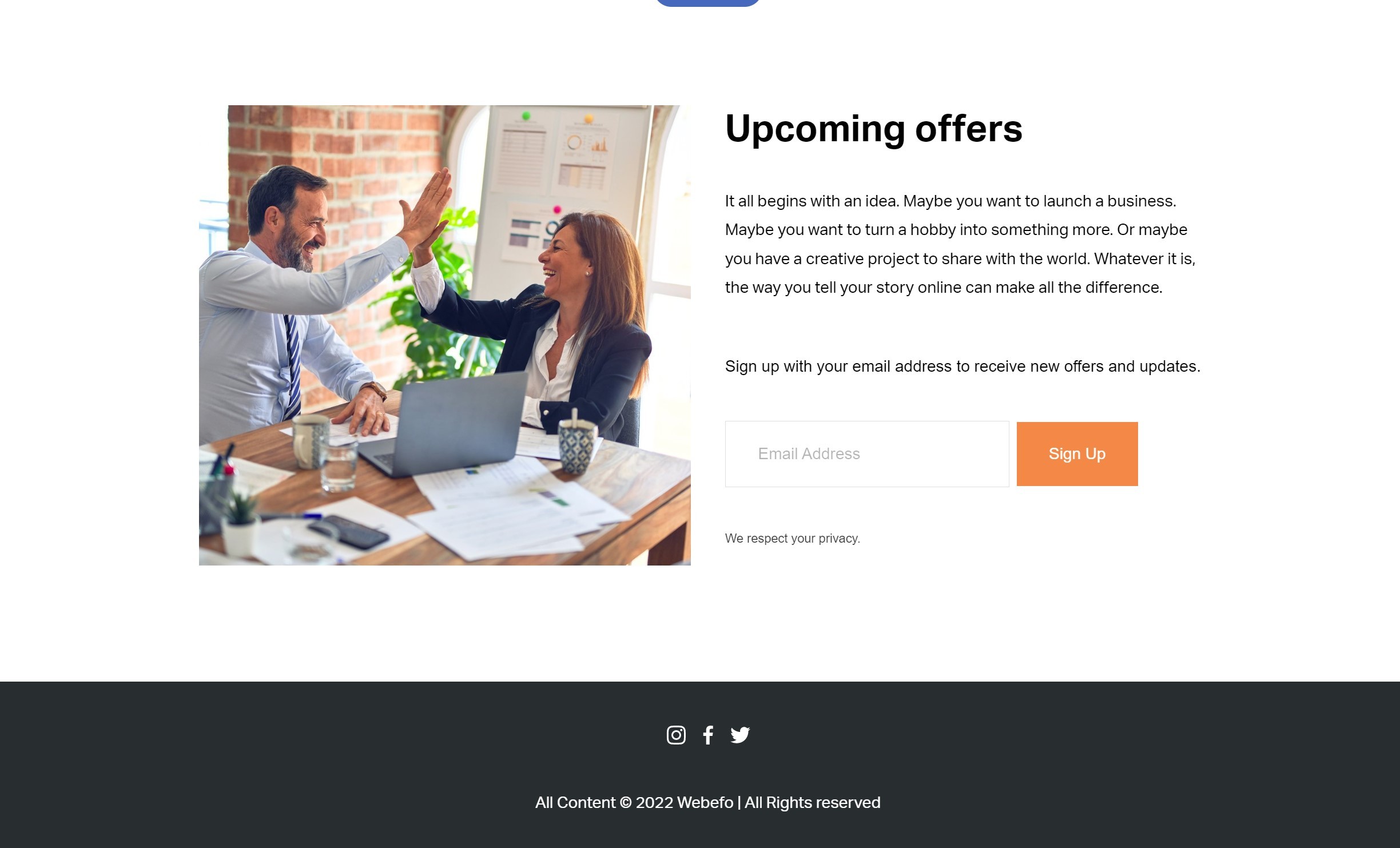
Like this:
Since the footer section with your copyright info was removed, I recommend adding it to the bottom of your landing page with a new section and text block.
Also, since we removed the header, I recommend adding a professional banner image to the page using the squarespace 7.1 Heading section.
You e just created a custom landing page! That's awesome!
Now, I would love to see the custom Squarespace landing page that you create to share a link in the comments below!
FAQ: Quick and Easy Ways to Create a Landing Page in Squarespace
1. Do I need technical skills to create a landing page?
Not at all! Squarespace's drag-and-drop editor makes it easy for beginners to design professional-looking pages.
2. Can I use a template for my landing page?
Yes! Squarespace offers a variety of customizable templates perfect for creating landing pages quickly.
3. What key elements should a landing page include?
Ensure you have a clear headline, engaging visuals, concise content, a call-to-action (CTA), and contact information.
4. How do I optimize my landing page for SEO?
Use targeted keywords, add meta descriptions, and ensure mobile responsiveness for better search engine rankings.
5. Can I integrate forms or links into my landing page?
Absolutely! Squarespace allows you to add contact forms, newsletter signups, and external links effortlessly.
— If you need any help with your Squarespace website or landing page then feel free to CONTACT US today! We would love to help set you up for success.
What You Need To Do Before Hiring a Squarespace Designer.
Before you hire a Squarespace designer, make sure to have a clear vision for your website and what you want it to look like. You'll also need to have an idea of the budget you're willing to spend and what features are most important to you. Once you have all of this information, it's time to start looking for candidates.
If you're thinking about hiring a Squarespace designer, there are a few things you need to do first.
What is the #1 goal for your website?
When it comes to your website, what is the one goal that you have in mind? Is it to make money? Increase brand awareness? Connect with new customers? Whatever your goal may be, make sure that it is specific. That way, you can develop a plan of action to help you achieve it. What is your website’s purpose? What do you want your potential customers to know about your company and/or products? Remember, the purpose of your website is to help you connect with potential customers in a way that you can help them solve their problems.
What pages do you want for your website?
When you build a website, one of the first decisions you have to make is what pages to include. Do you want a home page, a page about you and your business, a page with products or services, a blog, or something else? Once you decide what pages to include, you need to create them.
The home page is the first page people see when they visit your website. It usually has a welcome message, information about your business or organization, and links to other pages on your website. The page about you and your business might include information such as who you are, what you do, why customers should choose you, and contact information. The page with products or services might include images and descriptions of the products or services you offer, pricing information, and contact information.
What functionality does your website need?

When it comes to creating or updating a website, one of the most important decisions you'll make is what features and functionality your site needs. Your website's purpose will help guide this decision—for example, if you're running an online store, you'll need features like a shopping cart and payment gateway. But even if you're not selling anything online, there are still plenty of features to choose from.
To get started, think about what your website will be used for. Are you providing information? Showing off your work? Building a community? Once you have an idea of its purpose, you can start thinking about the specific features that will help it achieve that goal.
Choose a Squarespace plan for your website based on your website needs.

If you're looking to build a website, Squarespace is a great option. With a variety of plans to choose from, you can find the perfect one for your needs. Whether you're starting a small business or creating a personal website, there's a plan that's right for you.
One of the best things about Squarespace is that it's easy to use. You don't need any coding experience to create a website with Squarespace. Just choose your template, add your content, and you're ready to go.
Squarespace also offers a wide range of features, including built-in SEO tools, eCommerce capabilities, and more. And if you need help getting started, there are plenty of tutorials and support options available.
What is the scope of your project?
When you are starting a new project, it is important to understand the scope of what you are undertaking. The scope defines the boundaries of the project and outlines what will and will not be included. It is important to have a clear understanding of the scope so that everyone involved knows what is expected and there are no surprises down the road.
How many pages do you want for your site, and how much content will go on these pages? And perhaps, how many pages will need content?
Web design project prices are likely to be set on the number of pages produced. A smaller web page with a three-page design will be less costly than a 20-page web design project. Consider the fundamental ideas about each page, the home, About, service, and the contact page, etc., as well as any others that your corporation may need.
Prepare your website branding element.

When you are creating a website, one of the most important decisions you will make is what branding element to use. Your branding element will be the visual representation of your website and will be seen by all who visit. It is important to choose wisely and carefully, as this element will represent your business.
There are many different types of branding elements to choose from, and each has its own advantages and disadvantages. Some of the most popular options include logos, fonts, colors, and images. Each of these elements can be used in a variety of ways to create a unique and memorable website.
The best way to decide which branding element is right for your website is to think about your target audience. What type of image do you want to portray? What colors are associated with your brand? What type of font would be most appropriate?
What do you want to be written on your site?
When it comes to creating a website, the first and most important question you need to ask yourself is: what do you want to be written on your site? This question can be broken down into a few different categories.
First, you need to decide what type of website you want. There are many different types of websites, from e-commerce sites that sell products and services online to information-based sites that offer news and articles to blogs that share personal thoughts and experiences. Once you've decided on the type of website you want, you then need to come up with a topic or topics that will be the focus of your site.
Prepare your website copywriting.
Copywriting for your website is an important part of your online marketing strategy. The text on your website must be well-written and persuasive in order to convert visitors into customers. Here are a few tips to help you write effective website copy:
- Start with a strong headline that catches the reader's attention.
- Write in a clear, concise style that is easy to read.
- Use persuasive language to create a sense of urgency and motivate the reader to take action.
- Make sure all of your text is properly formatted and easy to navigate.
- Proofread your copy for spelling and grammar mistakes.
- Always keep the needs of the customer in mind when writing website copy.
Source professional photos for your website.
A website is often the first impression a customer has of a business. A professional website with high-quality photos will make a good impression and show that the business takes itself seriously. Professional photos can be expensive, but there are many sources for free or low-cost photos. The most important thing is to use high-quality photos that match the tone and style of the website.
There are a lot of websites online from which you can download premium-quality pictures to use in your web project without needing to credit or link to the original source. I recommend Unsplash.com, Pixabay.com, and Pexels.com. Those sites allow you to use their high-resolution images free of charge!
In conclusion, there are a few things you need to do before hiring a Squarespace designer. First, make sure you know what you want your website to look like. Second, research different designers and find one that fits your budget and style. Third, create a design brief to give to the designer. Fourth, be prepared to give feedback and make revisions. And finally, be patient and allow the designer enough time to create a perfect website for you.
FAQ: What You Need to Do Before Hiring a Squarespace Designer
1. Do I need to have my content ready?
Yes! Preparing your text, images, and branding elements (logos, color palette, etc.) beforehand ensures a smoother design process.
2. Should I know my website goals?
Absolutely. Define what you want your website to achieve—more sales, bookings, or showcasing your portfolio.
3. Do I need to select a Squarespace template?
Not necessarily. A skilled designer can recommend the best template based on your needs.
4. What if I’m unsure about my branding?
No problem! Share your vision, and your designer can guide you with branding suggestions.
5. Is it essential to set a budget?
Yes, having a clear budget helps your designer offer tailored solutions without surprises.
We hope that our blog provides all the information you need about whether or not you should (or shouldn't) hire a designer, but if there's anything further you'd like to know, please contact us.
Master the Secret of Branding Your Squarespace Website for Ultimate Success
If you are trying to launch or build a successful business, you need to look at the website branding part. Your brand is what the outside world thinks of you; it’s a collection of impressions you build up over time. These days your first impression is often made online. You need a website, and your website needs to be a great reflection of you. A branded website.
What Is Branding?
Essentially, your brand is all about how people perceive you. There’s no single correct way to present your brand online, but there are some elements that are universal. A logo is an important aspect of brand identity, but branding has much more to it than that.
You see, website branding is about a lot more than logos and colors. Branding is more than aesthetics, and the same is true for your website. The founder of Amazon,
Jeff Bezos, says it even better: “Your brand is what other people say about you when you’re not in the room.”
What is Website Branding?

Website branding is visually representing your brand through your website. Every website you visit has some amount of branding incorporated into its design. And website branding involves making every aspect of your site consistent with your brand’s personality, from your website logo, images, and layout to your web copy and blog posts.
Now, we’ll walk through exactly how to get to the heart of your business by clearly and consciously identifying your target market and developing your brand website, creating an emotional connection with your community.
So, without further ado, here are some actionable tips for effectively branding your small business website.
1. Understand Who You Are and Your Customer:
Know who you are. You must first understand your customers, their needs, and how you can help them. You know the benefits you can offer to your customers. You know the value you bring to your customers. Now, you need to find a way to clearly communicate that value and its benefits to your prospects in a way that doesn’t sound like every other business out there.
In order for you to do this, you need to understand who you are and what makes you different from every other business on the market.
2. Create a Professional Logo:
Your logo is the first thing that people see when they visit your website or read any of your content. It’s your first impression, and it needs to be perfect.
There are 3 things you should keep in mind when creating a logo:
Color is one of the most important aspects of your logo and can make or break it. Logo design could mean the difference between getting a client to stay with you for years or making them leave and take their business elsewhere. The right color scheme will help you get more attention, boost brand recognition, and build connections with consumers.
3. Add Professional Color, Images, and illustrations:

Your brand images and illustrations should also complement your brand’s color palette. Take your own photographs or create your own images, and be sure your use of color doesn’t clash with your site’s logo or background.
Appropriate color selection is important for any site that wants to convey a professional image. A study by the University of Cincinnati found that the use of certain colors can increase the perception of trustworthiness and quality in an organization. The study found that these colors are well-suited to business:
- Blue
- Green
- Orange
- Purple
- White or light gray (only when combined with other colors)
4. Keep your Website Simple:
The key to success is to create a site that meets the needs of your audience. If it’s too complicated or cluttered, they’ll have trouble finding what they’re looking for. It’s better to focus on the simplicity of your content and give them an experience that will keep them coming back.
Also, Your websites should be clean and simple. That’s the best way to ensure they are easy to read and navigate. But there are many other benefits to a minimalist web design.
The first is that it makes your website easier to load and run efficiently. As a result, you’ll reduce operating costs, which is great for your bottom line.
5. Create a User-Friendly Site Layout:
Mobile is not just a technology; it’s an attitude. Mobile is more than a trend, as it is becoming part of our lives. We are always connected—there’s no excuse for your website to be anything but mobile.
It’s time to take a step back and think about what it means for your website to be mobile. Your website isn’t just something you put up on the web anymore; instead, it is an integral part of your marketing strategy and the way in which you communicate with consumers. Keeping this objective in mind will help you avoid some crucial.
Most business owners don’t realize that many of their potential customers will only ever come across their business through a mobile device. It just makes sense to optimize your website for mobile traffic. A 2017 survey from Google found that 73% of people are more likely to use a business with a mobile-friendly site, and 48% of them will not use a business with an unfriendly one.
By next year, it is projected that mobile search will be responsible for more than half of all digital ad spending globally. If you have no idea how to create a website that looks great on mobile, contact us
6. Add a Blog Page for Search Ranking:
If blogging is the best way to promote your business and increase website traffic, then it makes sense to focus on creating content that your audience wants. For a blog to be successful, there must be a balance between quality and quantity.
As with all things in life, when you start out, you want to do more of something so that you can learn from your mistakes and improve your skills. This same concept applies to blogging. If you want to create more traffic for your website, then write more content for your blog.
Every blogger should have a free email list. This is a list of people who want to be notified whenever you post something new on your site. This can be easily created using Aweber, Mailchimp, or other similar tools.
7. SEO and Content Marketing:

SEO and content are two words that I always think about together. Content is king, and King Content is search engine optimization. Without it, you will be left behind by your competitors, who understand the value of good content to drive traffic.
When building a blog for your brand, you’ll want to consider:
How to identify your target audience?
How will the content get found in organic search results?
When is the optimal frequency and scheduling of publishing?
What is the plan for promoting the content?
8. Stay Active on Social Media:
As the age of social media grows, it is becoming more and more important for businesses to build a strong brand presence on social platforms. Having a well-built social media strategy is helping small businesses to improve their reach and expand their audience. It helps them to interact with their customers and get feedback about the services they provide.
To make your social media efforts more effective, it’s important that you keep your accounts active. Posting content consistently is one of the most important elements of any successful social media campaign.
If you have any questions about the process of branding your website or are looking for help after you launch a website,.
Feel free to CONTACT US TODAY! We would love to help set you up for success.
Why I Should Hire Professional Web Designer?
One of the biggest questions when you starting a new business is ‘should I hire a professional or DIY it?
Your website is the online face of your business. And if your website isn’t easy to understand, simple to use, and visually appealing, you could lose business or be out of business. These days there are so many options for DIY sites and with platforms such as Wix, Shopify, and our fave, Squarespace you will rightly have doubts about why would you need to hire a designer. This post will cover some of the important pros and cons of hiring a designer for your website.
Saving Time:

Time is money! Whether you’re techy or not, learning a new platform is hard work! One of the biggest complaints we hear from DIYers is “I didn’t know much about my need and had to change templates and redesign all over again.” On average, it takes us around 3 weeks to create a professional website and we know Squarespace like the back of our hands. Do you have the time to create a new site and also give your business the attention it needs? We take the time to develop your website, allowing you the time to do what you do best. Also, hiring a professional gives you the benefit of hiring an expert who knows successful, efficient ways to create a web site quickly.
Making it unique:
There are about millions, even billions of websites on the Internet. How are you going to make yours stand out? A professional designer is able to create a web site that is unique to your business, pleasant on the eye, have clear and easy navigation, load efficiently, and work properly in all the major browsers. We live, breathe, and work Squarespace. We know what works best and where we keep the user experience a top priority and know how to increase your website's functionality and visibility. We have spent so much time learning about the customer experience, what they look for, where they are most likely to click first, and what makes them click away. Have you ever visited a DIY website and not known where to go first? The typical user will click away from a website that doesn’t grab their attention in seconds. Design and functionality are the most important aspect of a website and by hiring a website designer, you will ensure that your website serves its purpose.
Making it easy to use:
A professional web designer will keep your visitors in mind by making it easy for them to navigate and travel around the website without getting confused.
If you have your website designed by us, our custom design service is included. We know the importance of maintaining a strong brand identity so custom design all aspects of your website such as icons, backgrounds, and branded imagery.
Website platforms such as Wix and Squarespace also have limited fonts and styles available to their users so we use HTML and CSS to completely custom design each page, font, and image to your brand's aesthetic.
Saves Money:

Let’s face it: your job as a business owner is to run the business. It’s not to create your company’s website, and a business owner who tries to do that is only taking valuable time and money away from the business they should be running.
However, as tempting as it might be to DIY your website, hiring a professional is such an important investment to your business. Your website is a major part of your brand, it reflects your business and is most likely the first place people will look to find what they need. We often ask people to think of it this way, a website is there to bring in more customers, a way for people to easily see your services and find the information they need. A professionally designed, well-functioning website will bring in more clients and customers to your business. Yes, it’s a big investment at first, but more cost-effective in the long run.
Making it Search Engine (SEO) friendly:
Your presence on a search engine is imperative to success in today’s market. Web designers understand how to make your website search-friendly by understanding SEO, the process of increasing the visibility of a website on search engines through an understanding of backend algorithms. SEO is a complex and specialized skill and is something DIY websites often lack. Basic SEO and an SEO guide are included in all of our website packages so you don’t have to worry about delving into that minefield!
Your website needs to be optimized to appear in the search engines, even the best-designed website is useless if it can’t be found!
Mobile Responsiveness

Why it Matters: With over half of web traffic now coming from mobile devices, having a website that looks and functions well on smartphones and tablets is essential. A professional web designer ensures that your website is mobile-responsive, meaning it adjusts seamlessly to different screen sizes. DIY platforms often have limited templates that aren't optimized for all devices.
Example: If a website isn't mobile-friendly, users may struggle to navigate it, leading to high bounce rates. A professional ensures that all elements—such as menus, buttons, and images—resize appropriately for mobile users.
Faster Load Times
Why it Matters: Speed is a crucial factor for both user experience and SEO. Websites that load quickly reduce bounce rates and improve conversion rates. A professional designer knows how to optimize images, streamline coding, and leverage caching techniques to make your site load faster.
Example: If your website takes too long to load, visitors may leave before it even fully appears. This negatively affects your rankings in search engines like Google.
Conversion Optimization
Why it Matters: The primary goal of your website is often to turn visitors into customers, whether that’s through making a purchase, filling out a form, or signing up for a newsletter. A professional web designer can incorporate conversion rate optimization (CRO) techniques such as strategically placed calls to action (CTAs), clear navigation, and user-friendly forms.
Example: A well-designed landing page that guides visitors through a purchase or sign-up process has a much higher chance of converting visitors into paying customers.
Security Measures

Why it Matters: As cyber threats become more sophisticated, ensuring that your website is secure should be a priority. A professional web designer can implement key security features, such as SSL certificates (which encrypt data), secure payment gateways, and regular updates to protect your site from vulnerabilities.
Example: An unsecured website risks exposing customer data, which can lead to identity theft or loss of trust. A professional designer will safeguard your website with the latest security protocols.
Scalability
Why it Matters: Your business may grow, and your website should be able to scale with it. Professional designers build websites that are scalable and can grow in functionality as your business evolves. Whether you need additional pages, new features, or an expanded e-commerce platform, a custom-built site can adapt to these changes.
Example: A professional web designer ensures that as your business adds new services, products, or content, your website can be easily updated without a complete overhaul.
Ongoing Support and Maintenance
Why it Matters: Websites require ongoing maintenance to keep up with software updates, security patches, and evolving best practices. Many DIY solutions do not offer support for ongoing updates, which can leave your website vulnerable or outdated. A professional designer often provides ongoing support and can make improvements as needed.
Example: With regular maintenance, a professional ensures that your website remains functional, secure, and up-to-date with the latest trends and technologies.
Brand Cohesion
Why it Matters: Your website is a key part of your brand identity. A professional web designer will ensure that your website is consistent with your brand’s voice, values, and aesthetics. This consistency is important in building trust and credibility with your audience.
Example: A custom website designed with your brand’s color scheme, typography, and messaging helps reinforce your identity and differentiate your business from competitors.
Enhanced User Experience (UX)
Why it Matters: User experience (UX) plays a huge role in the success of your website. A professional web designer will optimize your site’s layout, navigation, and functionality to create a seamless and enjoyable experience for visitors. This reduces frustration and encourages users to spend more time on your site.
Example: If your website's navigation is confusing or cluttered, visitors are likely to leave. A professional designer ensures smooth navigation, keeping users engaged longer.
Custom Features and Integrations
Why it Matters: If you need specific features, such as a booking system, payment gateway, or custom integrations with third-party services, a professional web designer can build and integrate these features in a way that functions smoothly with your website.
Example: For a restaurant, a booking system that integrates seamlessly with the website allows customers to reserve tables directly, improving both customer experience and operational efficiency.
Analytics and Tracking

Why it Matters: A well-designed website is not only visually appealing but also allows for analytics integration. Professional designers can set up tools like Google Analytics, so you can track visitor behavior, conversion rates, and other key performance indicators (KPIs).
Example: Analytics can reveal which pages are performing well and which need improvement, allowing you to optimize your website to better serve your audience.
Making you trustworthy :
– A good web designer will be able to find ways to convey your trustworthiness through the use of images or text. This lets site visitors know there is a real human on the other side that is worth doing business with.
Faq:
Professional Web Designer Vs DIY Platform: Why Should I Hire a Professional Web Designer?
A professional guarantees an original and tailor-made solution for your website that covers all of your corporate needs whilst saving you stress and enhancing your search engine optimisation. They can also help maintain your site to keep it secure, easy to use, and mobile-friendly.
How long to design a website professionally?
So, on average it usually takes 3 weeks for an experienced designer to construct a good, working website. This frees you to run your business while experts take care of the details.
Does hiring a professional web designer cost more?
It might sound expensive in the first place but having an expert assists in saving plenty over time by maximizing your site’s functionality functionality, SEO, and delivery maximizing conversions and, in turn, retention.
Are professional web designers good for SEO?
Yes, a professional designers do know best practices for SEO and will optimize your website to rank higher in search engines, leading to more traffic and better visibility for your site.
Well, we hope that this blog answers all of your doubts about why you should (or shouldn’t) hire a designer but if you have any other questions, please Contact Us


